
Esri provides multiple options for extending the functionality to ArcGIS Pro. Add-Ins are one of the 4 extensibility points using the ArcGIS...
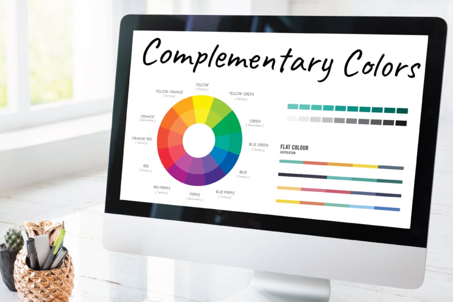
While text-based content is always important, knowing basic color theory can help you make your content stand out.
When creating a report with Infomaptic, one of the properties that you’re able to customize is both the background color and the font color. Choosing the best colors for your designs is all about what you want your colors to say. Colors can be divided into numerous groups that include various tints, shades, and saturation levels.
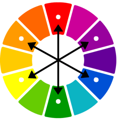
Complementary Colors
No matter what the color is, a complementary color will always be the one opposite it. When placed next to each other, complementary colors enhance each other, allowing the other to stand out more. They are also colors that tend to attract attention making this a first choice for artists and designers. The main benefits of complementary colors are providing contrast or creating neutral hues and shadows.
- Analogous Colors: Colors that are located close to each other or alongside one another when looking at a color wheel.
Examples of analogous combinations:
- Violet, blue, and teal.
- Red, fuchsia, and purple.
- Red, orange, and yellow.
- Green, blue, and purple.
- Monochromatic Colors: Color combinations that uses a single color as well as having variations of this same color.
Examples of monochromatic colors:
- Dark blue, slightly lighter blue, and light blue.
- Triadic Colors: The triadic are evenly spaced colors on the color wheel and are in the shape of a triangle.
Examples of triadic combinations:
- Red, yellow, and blue.
- Purple, green, and orange.
- Blue-purple, red-orange, and yellow-green.
- Tetradic Colors: Color combination that involves four colors or a double complementary set of colors in the shape of a rectangle.
Examples of tetradic color schemes:
- Red, green, blue-purple, and yellow-orange.
- Yellow, purple, blue-green, and red-orange.
The best way to learn what colors work well is to experiment with colors and ideas and create swatches or a color palette as you go to see how complementary colors can compliment each other. You can always refer back to the color wheel for inspiration.
Related articles

Dates in ArcGIS services are often time zone naive, meaning that the time zone is not specified. Infomaptic assumes Coordinated Universal Ti...

Infomaptic provides a simple What You See Is What You Get designer that allows you to quickly design templates by dragging and dropping item...