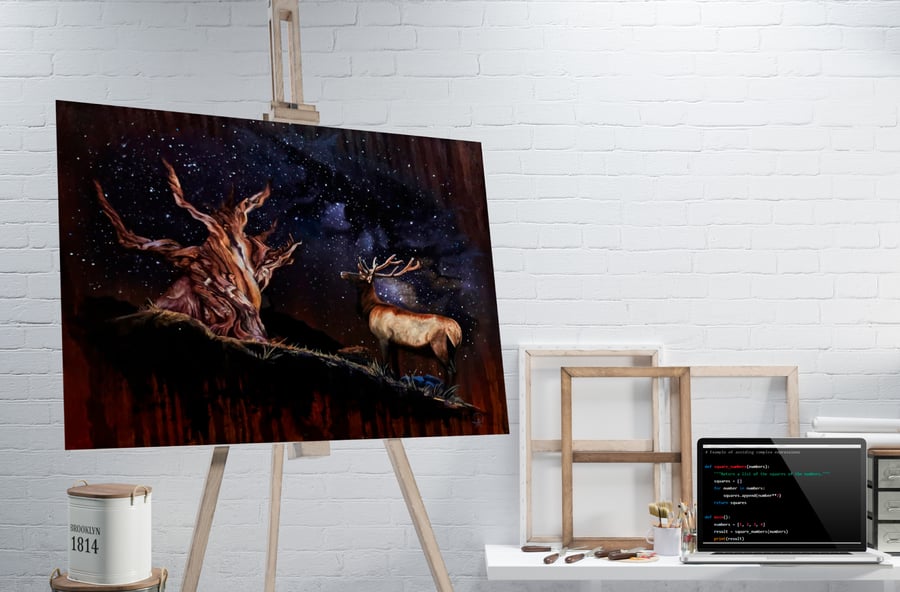
My Two Art Forms: Web Development & Painting

I’d always been the artsy kid. I’d fill multiple sketchbooks with drawings and usually had some doodle going while listening in class. Eventually this love of drawing and painting led me to become a working artist today. That said, like many other artists I have quite a few interests, and one of them is web development! At face value, programming seems like it’s completely the opposite of painting, a right-brained activity where painting would be considered left-brained. But are the two really so different? Let’s see what happens when pixels meet paintbrushes and code merges with canvas. Peel back those superficial layers and see that you might find some unexpected similarities. From the initial bolt of inspiration that brings designers and painters an enticing idea to the final (key?) strokes of creation, both disciplines share a common thread of creativity, vision, and meticulous attention to detail.
Many painters will tell you that there are few things as unsettling as a blank canvas. Similarly, a web developer encounters a blank screen. It stares back at them with that blindingly white window that is a blank HTML page. It’s the beginning of a journey filled with endless possibilities, and the initial moments are ripe with anticipation. In both cases you have to make a decision and put something down, which then informs the following elements. In painting, sometimes that means just getting a first pass of a messy monochromatic background going; anything but that blank canvas! A web developer may start partitioning the view into sections, dividing and conquering. It’s helpful when you have some direction to go in ahead of time, perhaps a request or commission from a client who gives you your requirements. Either way, whether starting from scratch or fulfilling a list of requirements, oftentimes both painters and web developers go through a similar planning phase. Sketching, drawing, thumbnails, mockups, wireframing, making mood boards, word association webs even! Whatever alchemy they personally enjoy doing to speed the Muse along.

Alright, so we have a basic idea of what we want, but where should everything go on our physical and digital canvases? In both painting and web design, composition is key. A painting with poor composition just looks off. You know it when you see it. The image feels unbalanced, the flow of the piece feels perhaps like it’s going off the boundaries of the canvas, or maybe you’re not quite sure where to look or what’s even going on… it’s pretty uncomfortable really. Poorly designed websites are similarly uncomfortable and confusing, with most users completely abandoning and even resenting a site if they feel frustrated using it. Clearly, both artists and designers must consider elements such as balance, focal points, and visual flow to guide the viewer's eye smoothly through their piece. Whether arranging elements on a canvas or a webpage, achieving harmony is paramount.
Ah, the vibrant world of colors! From the subtle nuances of hue to the striking contrast of complementary tones, both painters and web designers use color to evoke emotions and convey meaning and messages. Red, for instance, has a tendency to grab attention and functionally is often used to highlight something. A dark red flower on a white background perhaps can make a point, or a glaring crimson error message can make another perhaps. Understanding color theory is essential in both disciplines. Whether selecting the perfect palette for a website or mixing paints on a palette, mastering color harmony enhances the overall impact of the final work.

But you can’t get away with just color. As both novice painters and web designers learn, texture also plays a critical role in the feel of your work. In a painting, sharp and blended brushstrokes have a very different effect, either lending intensity, focus, and solidity to your subject or a soft and dreamy quality. I remember quite well when learning to paint that if my drawing was accurate in terms of where something was placed but it still looked wrong, the problem most likely lay in getting the right texture. On a browser page, the tactile “feel” of a website can be influenced by font choices (serif vs sans-serif for instance), line thicknesses, borders, sharp or rounded corners, transparency, saturation, contrast, and even animation! Whether the work is a painting or a web page, texture engages the senses and creates a more immersive experience.
Oftentimes creativity is an iterative process. While some artists can create an entire painting in one studio session, in my case things tend to take more time over the course of several sessions. Painters and web designers understand the importance of experimentation and refinement. Just as a painter may paint over their work as they continually refine it session after session, a web designer iterates through multiple drafts to fine-tune their design, sprint after sprint. I can attest with quite a lot of personal experience that both disciplines require patience and perseverance, as the process from concept to completion is often paved with revisions and adjustments. And coffee. So. Much. Coffee.

Original artwork by Agnes Stelmach
At its core, while painting is often considered decorative (for the sake of this discussion anyway - don’t come after me with this debate!) and web design considered functional, they both aim to evoke certain emotions that are teased out with thoughtful application of the principles above. Both mediums have the power to elicit joy, sadness, awe, or even nostalgia, just with the use of some brushstrokes or some blocks of CSS. Whether you're wielding a paintbrush or crafting code, the creative process is a testament to the boundless power of human imagination. So, the next time you find yourself immersed in the world of web design, admiring that slick design you found that you’re now totally inspecting in Dev Tools and squirreling away notes on, also take a moment to appreciate the artistry that lies beneath the surface.


