A few weeks ago, I attended my first Esri Federal GIS Conference. It was an exciting time to be there, to learn new things, and to network w...
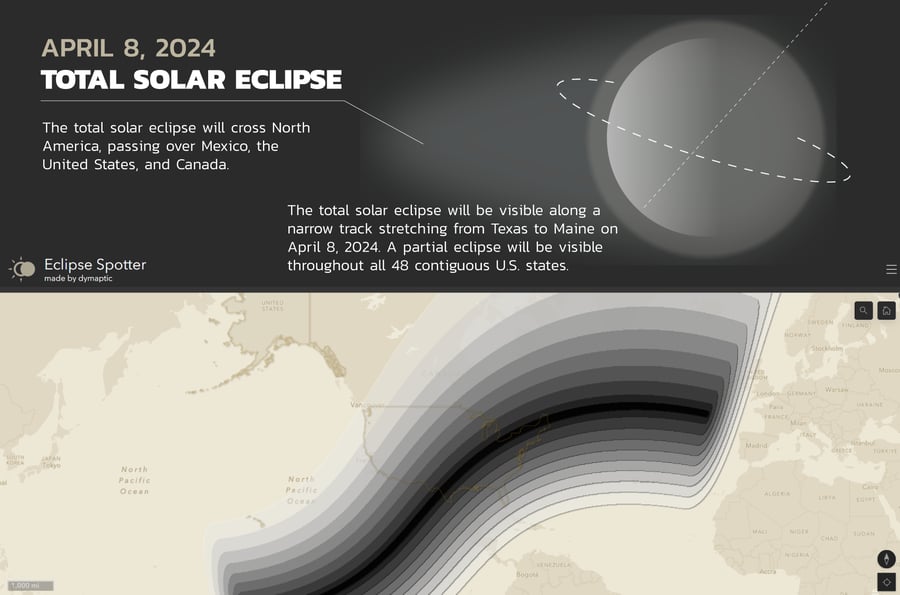
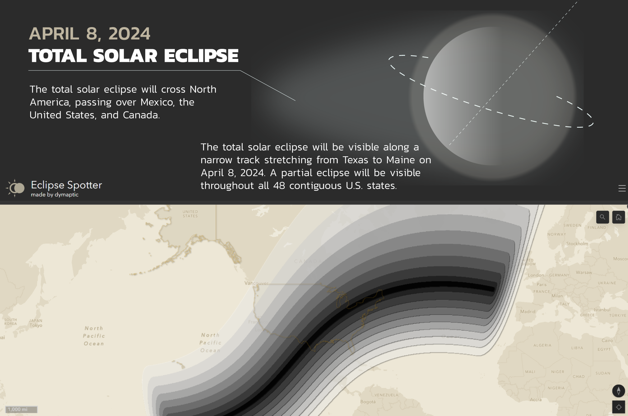
On Monday, April 8, a rare solar eclipse will grace the skies, and Eclipse Spotter (by dymaptic) is here to guide you on your journey to witness it. Solar eclipses are mesmerizing celestial events where the moon passes between the sun and the Earth, casting a shadow on our planet. It's a rare opportunity to witness the perfect alignment of celestial bodies. To use Eclipse Spotter, you can either zoom to your location, search for an address, or pan around the map. Then, select an eclipse symbol that represents a city to view details about the upcoming solar eclipse.
About the Data
To create Eclipse Spotter, we gathered data from NASA; specifically, we were interested in their data that displays the zones of solar coverage across the U.S. during the eclipse, as well as a JSON file of over 32k cities in the U.S. that included attributes of when the eclipse will occur for each city.
The last step of data processing was to perform an intersection between the city points and NASA's layer displaying percent coverage across the US. This added a new attribute for each point, representing the percent of maximum coverage of the sun to expect during the eclipse.
Symbology
There are so many fun ways to symbolize this type of data. We wanted to showcase how the coverage of the sun differs throughout the country during the eclipse, so here’s how we did it:
First, we created ten images representing solar eclipse coverages in 10% increments ranging from 0-100%. Then, in ArcGIS Online’s Map Viewer, we went into the Style for our Eclipse Cities point layer and created an Arcade expression that bins the percent coverage field into 10 categories, also ranging from 0% to 100%. At this point, our point layer was automatically symbolized with colorful circles, but of course, we wanted our fancy solar eclipse images instead! To accomplish this, we went into the Unique Symbols style options, clicked each unique category, uploaded our custom images, and replaced the basic circles with our new and improved solar eclipse symbols.
But we aren’t done yet… When we zoomed out to a full country view of the U.S., our 32k points didn’t look too good all smushed together, and it was very difficult to distinguish what was even on the map. So, we enabled a clustering effect in the aggregation settings, which de-cluttered the map and helped showcase our custom symbology.
Creating the Dashboard
Finally, we developed an Esri dashboard – we decided to keep it visually simple by using the map as our focal point and utilizing Arcade to configure indicator elements on the bottom to display information about the selected city. This included the name of the city, the time the eclipse will occur, the maximum coverage of the sun to expect, and a real-time countdown until the eclipse. Check it out and join us on a journey to witness the magic of the solar eclipse - get started now or wait until the next U.S. eclipse in 2045, and don’t forget your glasses!
Related articles


Hello, fellow GIS enthusiasts! Have you ever wanted to showcase your projects and data while also fostering community engagement? Whether yo...

If you missed us at the 2024 Esri Developer Summit in March, I presented on our chatbot named Jackson Carter which we built as a plugin for ...